
.jpg?VGhlIFBlcmZlY3QgU2xvdC1pbijmraPnoa4pLmpwZw==)


.jpg?MTkyMHg3MjDvvIhkZXPvvIkuanBn)
.jpg?MTAyNHg3NDDvvIhkZXPvvIkuanBn)
The fascinating story behind Homa’s name, colours and logo
Inspired by german iconic automotive brands

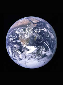
It was decided that the name of the new company would be formed by a fusion of the two German brands’ names, their names written in Chinese being “奥迪” (Audi) and “宝马” (BMW). So the first ideogram from Audi, “奥”, and the last one from BMW, “马”, were combined, reading, respectively, “ow” and “mah”, “Owmah”! What was particularly interesting to founder Shier Cai and his early companions was that, in the Latin alphabet, the shape of the letter “O” is perfectly round, and laden with symbolism. It is the shape of Earth, and hence embodies the vision of the company to make products for the world. Also, the circle is a symbol of inclusion, of community and of infinity, all positive values that well describe the spirit of Homa.
In addition, the new name sounded like the word “Home”. Nomina sunt consequentia rerum, it perfectly fitted the products’s primary aspiration: taking center stage in millions of homes around the world. Homes, rather than houses, for Homa’s products aim to provide that same sense of reassuring, emotional comfort and care for end customers and their families. An “H” was added, and the final lettering trimmed to the present “Homa”, which was to become a household name in cool technology, performance and design. Incidentally, the final “a”, respecting the Chinese pronunciation of 奥马, when rotated left by 90°, turns into an “e”, leading back to the concept of “home”.
The warm colours of cool
Other colours have also been introduced since. The orange seeds of hope Homa sowed in the cooling industry have grown and blossomed into colourful flowers, reflecting the company’s attention and care for the diverse cultures of partners, clients and suppliers.
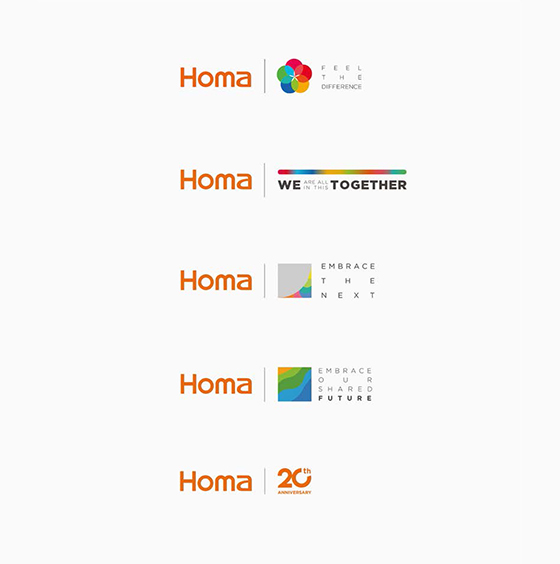
It started in 2019 with the “feel the difference” theme for that year’s Canton fair, and continued in the following years with different visual interpretations. In the midst of the pandemics, because of the travel and public gatherings restrictionsk the event had to be virtual. Homa attributed each colour an individual value shared with its partners, blending together in the logo with the payoff “we are all in this together”. Namely, courage; creativity; wisdom; inspiration; trust; sharing; support; passion; dream and caring. It continued in October of that same year with “we share more together” and the coloured leaves theme, a strong hint at resilience, growth and team spirit. In April 2021, the event’s leitmotiv was “embracing the next”, again underlining the spirit of pioneering and the urge to move forward and adapt to an evolving world. It only slightly changed into “embrace our shared future” in October 2021, to open up new perspectives, openly referring to sustainability, and reinforce the concept of sharing and caring.
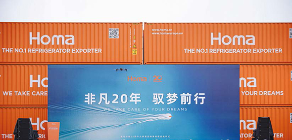
The 20th anniversary logo and its auspicious secret
THE SHAPE AND SOUND OF EXCELLENCE
Homa will continue to bring to the world the best possible cooling appliances, beautifully designed and taking food preservation to the next level. While doing it, Homa will keep nurturing the solid and truthful relationships it established in its first twenty years, taking care of its people, its partners and clients and, yes, your dreams!
Copyright © Homa 2024
All rights reserved